- All Plans
- Yahoo Press Release
- Bloomberg Press Release + Yahoo Finance
- Business Insider Press Release
- Benzinga Press Release
- Digital Journal Press Release
- US Times Now Press Release
- AP News Press Release
- Yahoo Finance Press Release
- Street Insider Press Release
- MSN News Press Release
- USA Today Press Release
Aerotower – Redefining Sustainability with a Bold Brand Identity

This case study delves into the branding strategy of Aerotower, a leader in vertical gardening solutions. It examines the company’s efforts to create a memorable and distinctive brand that reflects innovation, sustainability, and reliability. Key elements such as logo design, color psychology, typography, and website analysis are discussed to understand how Aerotower maintains brand consistency across various platforms. The study also explores the future evolution of the brand, with a focus on expanding product lines and enhancing customer engagement through interactive experiences. Aerotower’s comprehensive branding approach positions it as a trusted name in the sustainable technology sector.

United States, 18th Feb 2025 – In an era where sustainability and modern technology converge, branding plays a pivotal role in setting companies apart. Aerotower, a leader in vertical gardening solutions, has crafted a brand identity that not only reflects its commitment to sustainability but also communicates innovation and reliability. This case study explores the strategic approach behind Aerotower’s branding, analyzing its logo, website, and overall brand execution to understand how it establishes itself as a trusted name in the industry.
The Purpose Behind Aerotower’s Branding
Aerotower embarked on a branding journey to:
- Establish a distinctive and memorable identity in the sustainable technology sector.
- Communicate innovation, reliability, and eco-consciousness through visual and textual elements.
- Ensure brand consistency across all touchpoints, including digital presence, product packaging, and marketing materials.
With a growing consumer base looking for self-sufficient gardening solutions, Aerotower’s brand strategy needed to resonate with an audience that values both technological advancement and environmental sustainability.
Logo Design: The Visual Manifestation of a Brand’s Ethos

The Aerotower logo is a crucial element in establishing brand recognition. Its design embodies the company’s core values: growth, sustainability, and modernity.
Key Considerations for the Logo:
- Simplicity & Scalability – A design that remains clear and effective across digital and print platforms.
- Symbolism – Elements that suggest vertical growth, aeroponics, and eco-friendly living.
- Color Psychology – A palette that conveys innovation, nature, and trust.
- Memorability – A design that remains iconic and recognizable in a competitive market.
Aerotower’s logo integrates sleek typography with natural imagery, creating an intuitive connection between technology and nature. The use of geometric elements suggests precision and reliability, while the choice of color enhances the association with growth and sustainability.
Color Psychology: Creating Emotional Impact
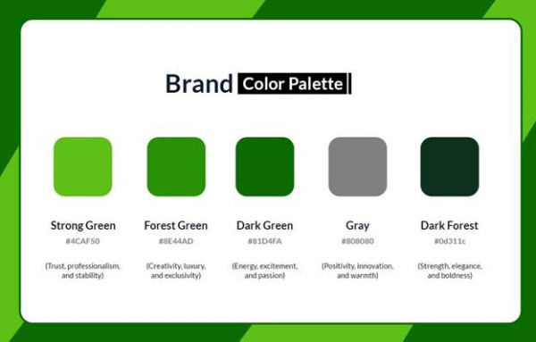
Colors play a pivotal role in brand perception. Aerotower strategically employs a carefully curated palette to reinforce its messaging:
Application of Colors: The blend of green and blue in the branding ensures an inviting and forward-thinking visual experience, reinforcing Aerotower’s positioning as a leader in sustainable technology.
Typography: Defining a Distinct Voice
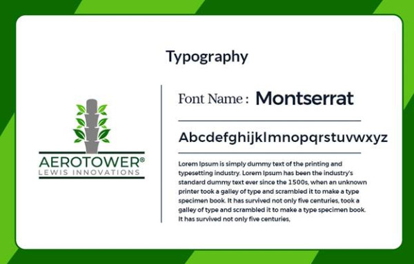
Typography often goes unnoticed, yet it plays a significant role in conveying professionalism and brand personality. Aerotower’s typography strategy includes:
- Primary Font: A modern sans-serif typeface to highlight innovation and approachability.
- Secondary Font: A clear, readable serif font for content-heavy materials, ensuring clarity and sophistication.
- Typography Balance: A mix of bold elements for impact and subtle typography for readability, ensuring seamless brand communication.
This careful selection ensures that the brand’s messaging remains strong, modern, and authoritative, whether in digital media or print collateral.
Website Analysis: A Seamless Digital Experience

A company’s website serves as a digital storefront, and Aerotower’s website, www.aerotower.ca, successfully aligns with its branding strategy.
Key Strengths of the Aerotower Website:
- User-Friendly Navigation: A well-structured layout ensuring ease of access to product details and educational resources.
- Strong Visual Identity: Consistent branding that mirrors the company’s values.
- Mobile Optimization: A responsive design that ensures a seamless experience across all devices.
- Engaging Content: Informative sections that educate visitors on the benefits of Aerotower’s products.
- Call-to-Action Clarity: Well-placed CTAs guiding users toward purchases or inquiries.
Aerotower’s website effectively bridges the gap between innovation and consumer engagement, making it a key component of its brand strategy.
Brand Implementation: Ensuring a Unified Presence
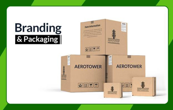
For a brand to establish authority, it must ensure consistency across all channels. Aerotower maintains a cohesive visual and narrative identity through:
- Product Packaging – Sustainable, modern, and aligned with the brand’s eco-friendly mission.
- Digital Presence – Engaging website, social media strategies, and educational content.
- Marketing Materials – Professionally designed brochures, ads, and promotional assets.
- Retail & Physical Branding – Store displays and signage that reinforce brand consistency.
- Branded Merchandise – A way to extend brand presence beyond its core product line.
This comprehensive brand strategy positions Aerotower as a trusted name in sustainable gardening solutions.
The Future of Aerotower’s Brand Evolution
Branding is an ongoing journey, and Aerotower’s identity will continue to evolve while staying true to its core values of sustainability and innovation. Future branding initiatives may include:
- Expanding product lines while maintaining design consistency.
- Enhancing interactive experiences, such as AR-guided gardening tutorials.
- Seasonal branding campaigns to keep engagement high.
- Strategic influencer collaborations to broaden brand reach.
These steps will further solidify Aerotower’s standing in the market as a leader in the green-tech space.
Conclusion: A Case Study in Branding Excellence
Aerotower exemplifies how a strong brand identity can drive consumer trust and market success. By strategically combining modern aesthetics, color psychology, well-structured typography, and a seamless digital experience, Aerotower has positioned itself as a pioneer in urban gardening solutions.
In an increasingly competitive market, branding is more than just visuals—it’s about creating a connection. Aerotower has successfully built a brand that resonates with its audience, inspires sustainability, and fosters a future-focused vision.
Final Thought: A well-crafted brand isn’t just an identity—it’s an experience. Aerotower’s branding is a testament to the power of strategic design and storytelling in shaping a company’s success.
Media Contact
Organization: PR Media House
Contact Person: Jake Parker
Website: https://prmediahouse.com/
Email: Send Email
Country: United States
Release Id: 18022523998